Every great night starts here.
How TopTicket looks, sounds and moves, for everyone who designs, builds or writes for it.
- Product
- Event ticketing, Uzbekistan
- Languages
- O‘zbekcha · Русский · English
- Mark
- Star Pass
Logo
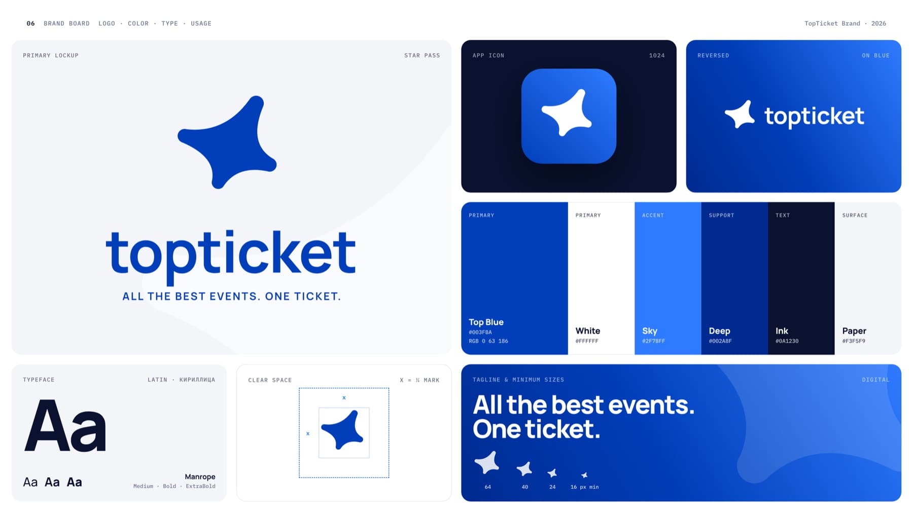
The horizontal lockup is the default. Use the stacked lockup where space is square or tall, and the mark alone where the brand is already named nearby, such as app icons and avatars.





The mark
Star Pass is a four-point star cut like a ticket. It is the most recognizable part of the identity, so it is never redrawn, outlined or decorated.
Cut like a ticket
Each side curves inward like the punched notch on a paper ticket. The shape reads as “ticket” before anyone reads the name.
Leans toward the top
The longest arm points up and to the right. It carries the “Top” in TopTicket and the feeling of a show about to start.
Soft, never sharp
Every tip ends in a small radius. Keep it that way at every size; never add hard points, outlines or glow.
One mark, four fills
Top Blue, White, Ink, and the Top Blue → Sky gradient. Use the gradient on dark surfaces and app icons, the flat colors everywhere else.
Space & size
Keep a clear zone around the logo equal to a quarter of the mark’s height (x). Nothing enters it: no text, edges or other logos.

Print: horizontal lockup at least 25 mm wide; mark at least 6 mm. Below these sizes use the mark alone.
Misuse
The logo files are final. These are the edits we see most often; each one weakens recognition.
- ✓Correctsupplied file, enough space
- ✕Stretched
- ✕Recolored
- ✕Rotated
- ✕Effects added
- ✕Busy background
- ✕Low contrast
- TopTicket✕Retyped wordmark
Color
Top Blue and White are the brand. Sky, Deep, Ink and Paper support them. Click a swatch to copy its HEX.
Line and Muted are for borders and secondary UI. Body text uses a slightly darker tint, #5C6681, so it passes WCAG AA on Paper.
- AaWhite on Top Blue · 8.68:1 · AAA
- AaTop Blue on White · 8.68:1 · AAA
- AaInk on Paper · 16.85:1 · AAA
- AaSky on White · 3.89:1 · large text only
linear-gradient(60deg, #002A8F 0%, #003FBA 45%, #2F7BFF 100%)
Use for hero surfaces, app icons, posters and ads. Keep text on it white. One gradient surface per screen or page.
Typography
Manrope does all the work: ExtraBold for headlines, Bold for UI, Medium for text. It covers Uzbek Latin (oʻ, gʻ, ʼ) and Cyrillic, so all three languages share one voice. IBM Plex Mono is the small utility face for labels, dates and codes.
64 / −4.5%
32 / −3%
17 / 0
16 / 150%
11 / +12%
Voice
TopTicket talks like a friend who always knows what’s on tonight: warm, quick, specific. Write each language natively instead of translating word for word.
Specific
Name the event, the date, the hall, the row. “Row 7, seat 18” beats “great seats”.
Short
Headlines stay under six words. One idea per sentence. Buttons say exactly what happens: “Buy ticket”, “Pay 300 000 so‘m”.
Honest
Never invent stats, ratings or reviews. Say “on sale” or “few seats left” only when it is true.
Applications
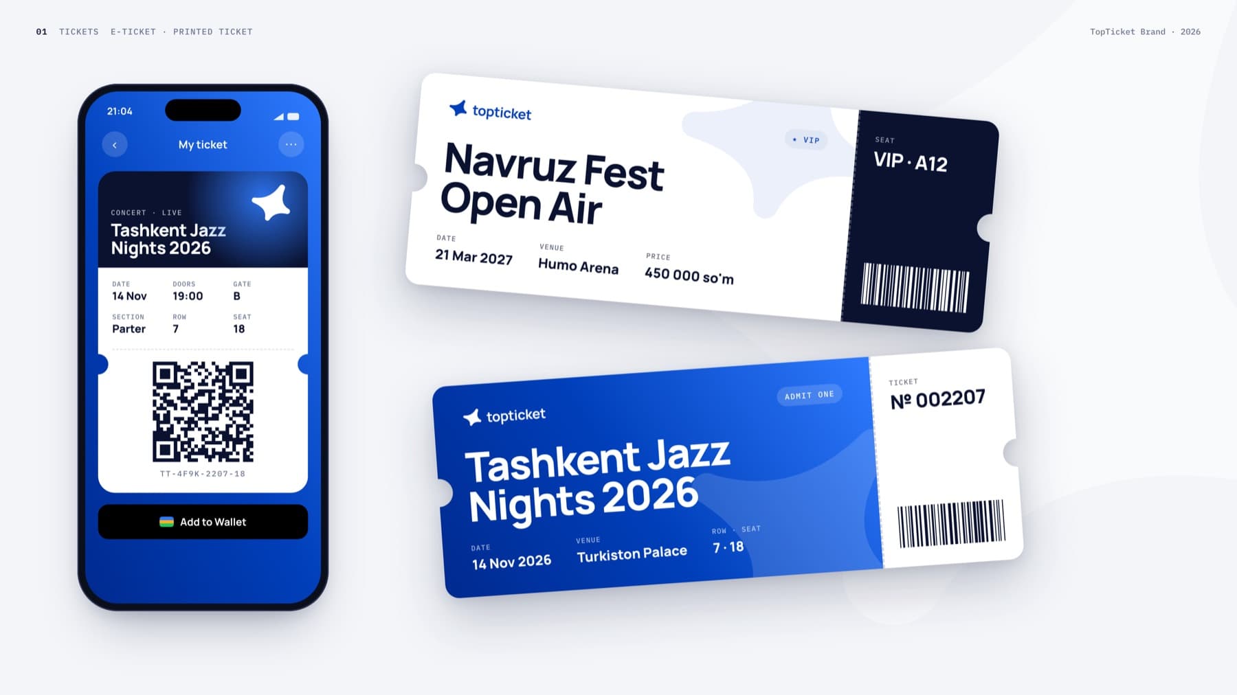
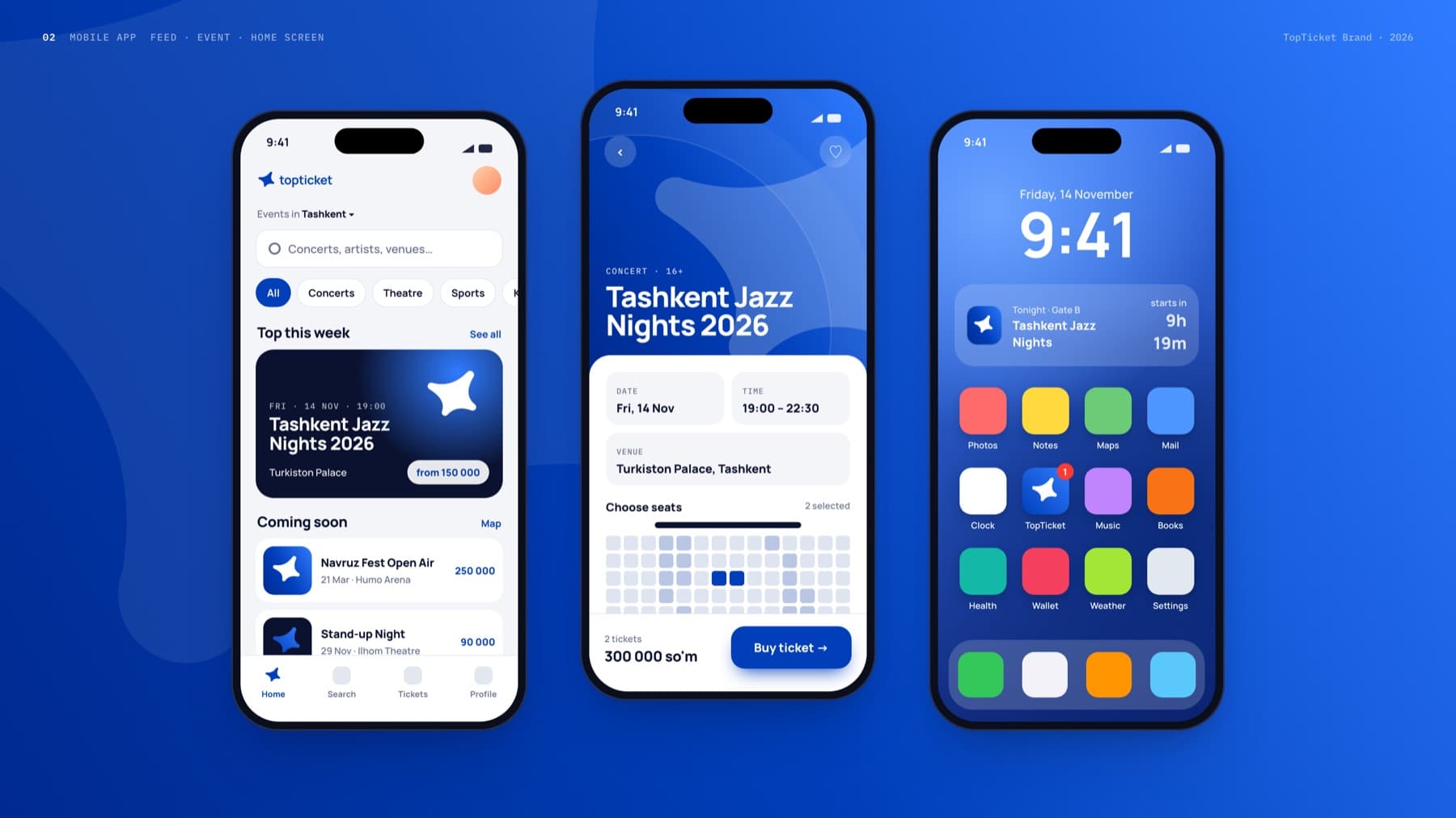
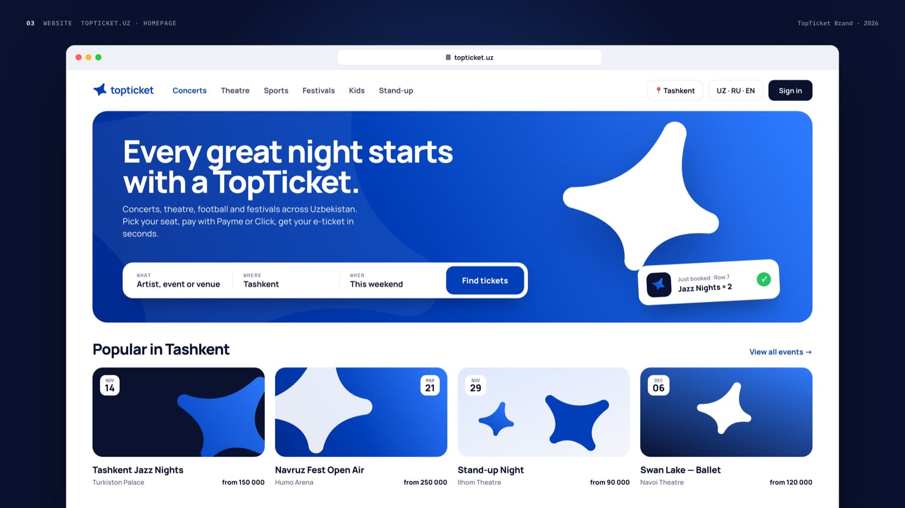
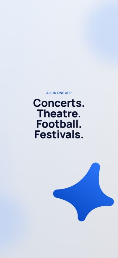
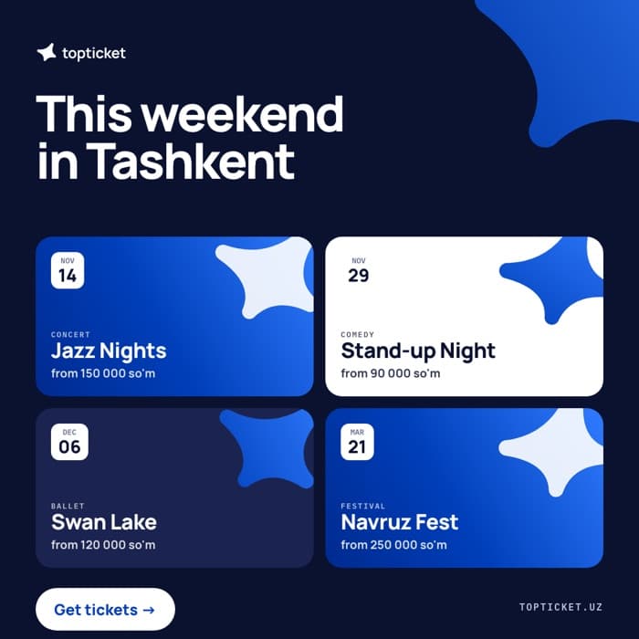
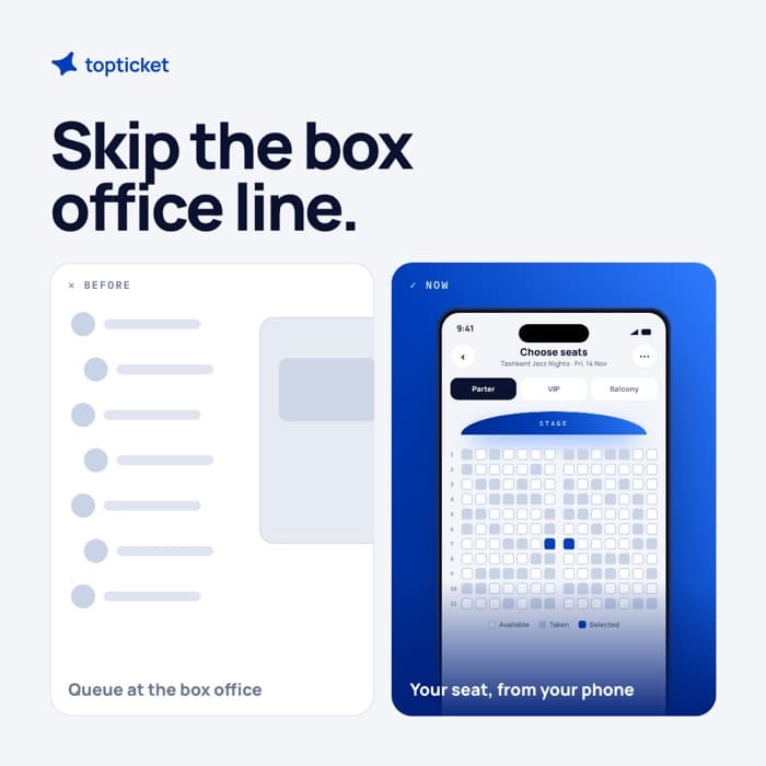
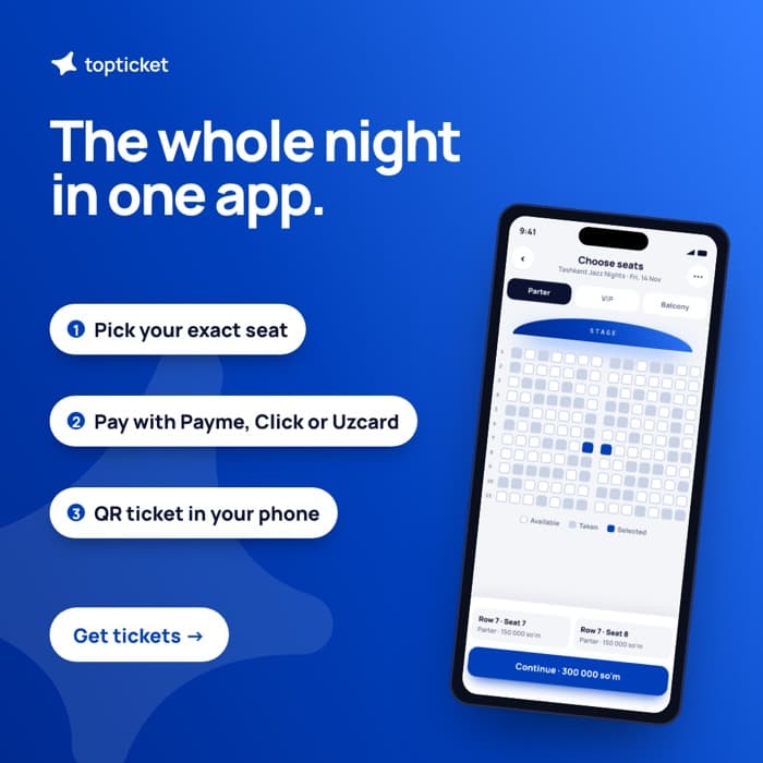
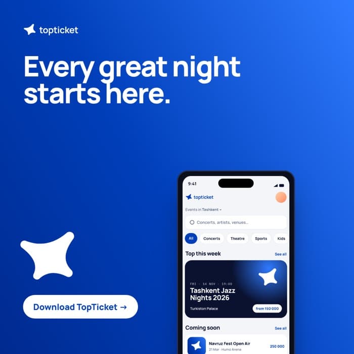
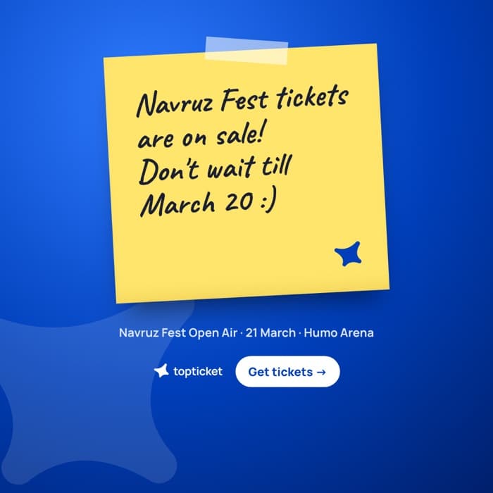
How the system comes together across tickets, product, web, social and the venue. Event names, dates and prices in these mockups are examples.
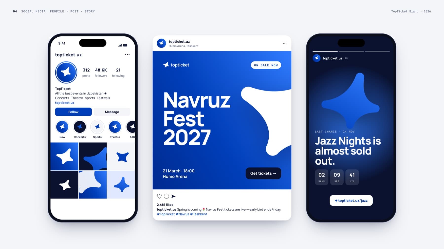
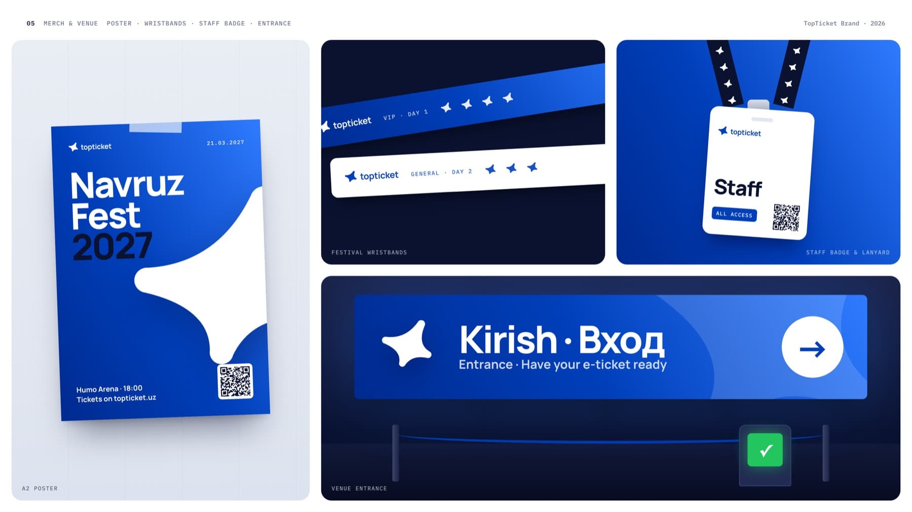
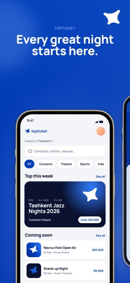
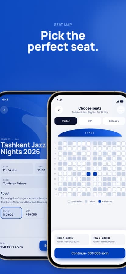
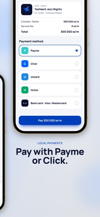
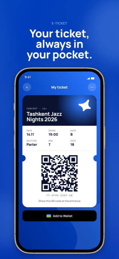
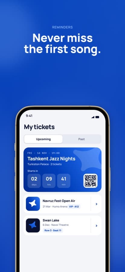
Motion
The mark is drawn by light, settles into a solid object and turns once, like a ticket flipped in the hand. Motion is quick, eased out and never bouncy.
- 0.0 sLockup grid opens and zooms apart
- 1.1 sA line of light traces the star
- 2.5 sThe solid mark forms and turns once in 3D
- 3.4 sMark slides left, wordmark writes on
- 4.9 sThe star lands as the dot on the “i”
- 7.0 sWhite mark flips in on Top Blue
- 8.9 sSize scale, then the grid returns so it loops
Easing: cubic-bezier(0.16, 1, 0.3, 1) for entrances · 1600×1200, 1080×1080, 1080×1920